How We Calculate Our Data
Measuring whether our public systems produce good and racially equitable outcomes.
RACE COUNTS measures outcomes, disparity, and impact in California and its cities and counties
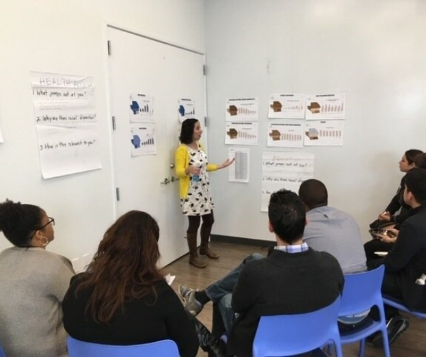
We measure outcomes, racial disparity, and population impacts for indicators across seven key issue areas: Crime and Justice, Democracy, Economic Opportunity, Education, Health Access, Healthy Built Environment, and Housing. Indicators for each of the seven issue areas were selected after reviewing literature and meeting with on-the-ground groups.
Outcomes tell you how well our systems are doing in general. If high school graduation rates are high, our education system is doing well; if our life expectancy rates are high, our health system is doing well, etc.
Disparity refers to how well our systems are serving different racial groups. We measure how different outcomes are between racial groups in two ways. The first is to compare one racial group’s outcome with another’s. For example, we compare the California Black foreclosure rate and the White foreclosure rate. The second way is to summarize the differences in outcomes among all races. We use a metric called the Index of Disparity, where we take the average of the differences in outcomes of all racial groups and compare it with the best outcome.
Impact is the total population of a place and puts outcomes and disparities in perspective. If voting rates are equally low in Los Angeles and Humboldt counties, the impact on state elections is much greater in Los Angeles because its population is so much larger than Humboldt’s.
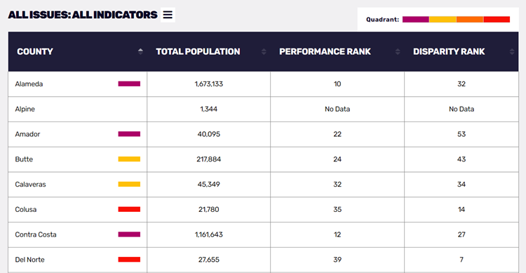
We show you the results of our outcomes, disparity, and impact calculations in two ways. First, we rank counties and cities based on their outcomes and disparities on the Disparity & Outcome Rankings Table page. And second, we assign counties and cities to one of four categories (Gains at Risk, Prosperity for the Few, Stuck and Unequal, and Struggling to Prosper) based on their systems’ outcomes and racial disparity compared to the averages. You can see the results on the Disparity & Outcome Scatterplot (also visualizes impact), Maps, Rankings Table, and the heat maps on the county Place pages.
For more detailed technical information about our methodology, visit our RACE COUNTS GitHub repository.